THEGRAPHICSSTUDIO
SERVICES + ABOUT

Northern Telecom:

Remember Them?

Working for J Walter Thompson in Toronto, I was assigned to one of the agencies largest clients, Northern Telecom, which at the time was the world's leading digital telecommunications and networking equipment manufacturer, every major North American corporation seemed to be using NT telephony equipment.

Along with my writing partner we were tasked to create a corporate print campaign that reflected NT's leading position in digital telecommunications.

We had seen a few examples of digital imagery, and were completely blown away by the technology and hoped the client would agree, they did, and we had to deliver on our sales pitch.

This proved difficult as all high end digital production was in the US through companies based in New York and L.A. set up to serve the movie and TV industries.

Although our client had deep pockets we discovered that these fledgling digital companies wanted outrageous fees to generate original images so our sourcing trips were essentially about acquiring rights to existing images at a reasonable cost.

The most notable company we dealt with was Robert Abel and Associates based in LA they used Cray Super Computers worth millions of dollars, housed in huge climate controlled rooms. Today those same images could be designed and generated in an afternoon on a laptop.

It was soon after the LA Olympics and we (art director & writer) were wined and dined by executives of the production company at a very posh restaurant in the Hollywood Hills. At that time, unknown to us , the company was looking for buyers and inexplicably were under the impression that we represented an interested party, suffice to say when all became clear the hospitality abruptly ended, we were abandoned and left holding a very large bill.

Labatts:

Blue Light TV & Print Campaign.

Working for McCann Erikson Advertising Agency, Toronto, on their Labatt's Blue Light account, brand requirements stipulated sun, sea and the sporty outdoors, I found myself shooting a series of TV commercials in Australia for five weeks.

Surprisingly our requirement for a large pool of talent meant that Australia along with its perfect weather offered a better bang for the buck than anywhere in North America.

During our time on location we were required to shoot images for print advertising and hired a Sydney based photographer to shoot what was essentially girly pin-ups, something that would not be considered appropriate today.

The clients marketing manager was our travelling companion for the duration and had his heart set on using Australian super model El McPherson, but not even his budget would stretch that far, so we found a look alike and flew her in from Pearth.

The second print image was intended to reflect an interior from one of the TV spots. It turned out that the director of our commercials was also a photographer and offered to shoot the images at no extra cost, so we went ahead and built a set in his studio and looked forward to the results, as we were flying back to Canada the next day we took the film with us and processed it in Toronto.

Unfortunately, it turned out that photography wasn't one of our directors strong points and the images were unusable, so with deadlines looming we were in a bit of a pickle and commissioned an air brush illustrator to save the day.

Coca-Cola:

‘Can’t Beat the Feeling’

Working freelance for McCann Erikson providing design and production for a series of transit posters in support of the "Can't Beat the Feeling" national TV campaign.

The production process went something like this.

The people were photographed in California and the product in Toronto both on film, the background palm leaf illustration was painted on stretched paper and copy photographed on film and the custom font was designed and drawn by me for the tag line and copy photographed on film.

The design process was all analog, black & white copy prints [stats] were made at various sizes and the design, worked out with the aid of a Lucy using pencil on tracing paper scaled to 25% full size.

Design approved, the artwork was assembled using the pencil tracing as guide by cutting up black and white copy prints and pasting them to an art board using rubber cement [cow gum] overlayed with colour specifications (Pantone Swatch Numbers) and any other special instructions.

The completed artwork was then sent to a printers film house to assemble full size colour film from the original transparencies, using the black & white artwork as a guide, then that film was used to create the final cmyk printing plates.

It was customary in those days for the art director to attend the print run, it usually took place in the early hours of the morning at some industrial location miles from anywhere, the purpose was to check the colour integrity as proofs came off the press, in truth only very small tweaks could ever be made once on press.

BIBA:

Custom Typefaces.

Whitmore Thomas were responsible for the interior design and branding for the refurbishment of the Derry and Toms department store into BIG BIBA on Kensington High Street, London.

My girlfriend at the time, Kasia Charko, was working with Steve Thomas (Creative Director) developing illustrative iconography for the various departments that were to be spread over the eight floors of the Art Deco building.

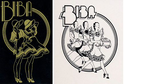
The graphics part of the project was vast, it included custom typefaces, illustrative logos, signage, advertising, promotional materials, packaging and much much more, the list was long and the team small and another pair of hands needed, so thanks to Kasia's recommendation, this became my second job since leaving art college and I joined the team.

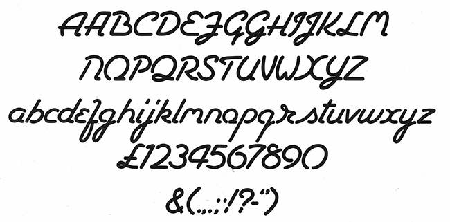
My work was more production than design but I did get involved in the creation of some of the typefaces. The fonts were developed on paper and artworked in black ink on card using french curves compass and lots of opaque white paint, I remember no matter what I did I couldn't overcome the media and the edges never looked crisp.

One day I was invited by the Type House to watch the process of transforming my, not so perfect, work into a real phototype fontface.

Using my artwork as a guide, a young cockney girl wielding a scalpel and using great skill, cut perfect outlines of each character in Rubylith Film, the edges were sharp and contours perfect, I wish I’d known this sooner and would't have worried so much about perfection, thankfully it was her work that was used to create the actual fonts.

For a more detailed and a personal perspective visit the blog of Kasia Charko , who's illustratiive work was a significant part of the BIG BIBA branding.

TOP